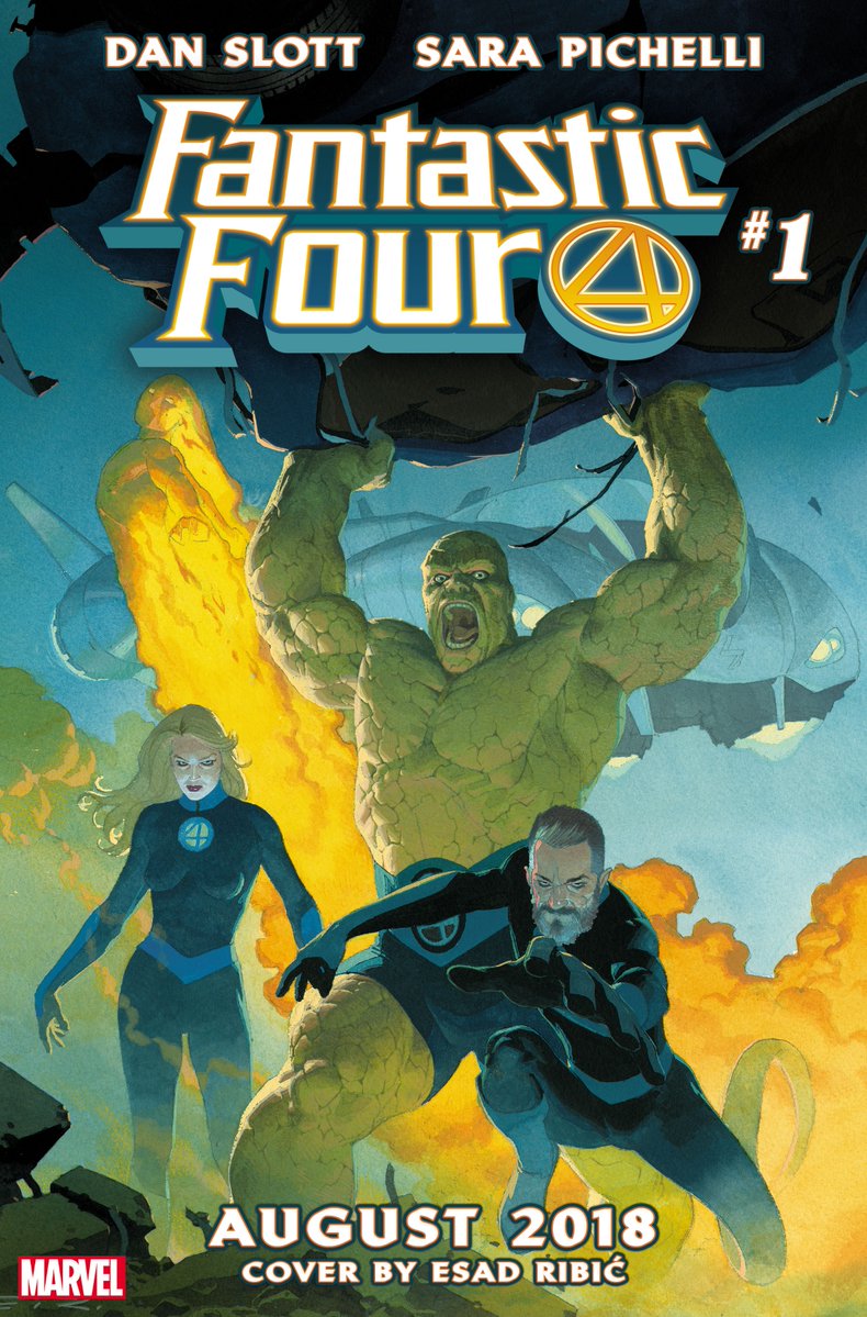
>>99979078>how can you guys complain about thisThat is a pretty awful rendition of ben. And you can make more "realistic" highly rendered versions of him that actually look on model. See pic related.
Also sue looks like an old hand with no muscle definition, her shoulders don't even look painted properly. And forget reeds' randomly bendy leg almost pointing to the odd use of negative space that makes the cover look really bad composition wise. You could actually really improve this cover by slanting it, and keeping the logo where it is to draw you up to johnny and down through his trail into reed and through. But this cover just lacks any energy. It's not BAD, but it's certainly not any good. It seems really quick and lazy.
Also, shading with greys? ew. Looks dirty and washed out instead of adding depth it just looks smeared in dirty paintbrush water for "texture" because the longer an an image takes to read the better it supposedly is and texture makes your eye slow down and focus on it more. A lazy tactic.
Also the dirty fart trails in front of sue were probably supposed to be behind her? not sure if that's johnny's flame trail or part of the random explosion on the left which seems to be behind johnny and not part of his flame trail?
I feel like I've spent more time thinking about this cover than whoever painted it did.