>>100949162>aspiring character designerWell you're going to be a terrible one, then. I work as a character designer. The other two in that image had their reasons as well, but Lightfury was designed like this delicately for many reasons.
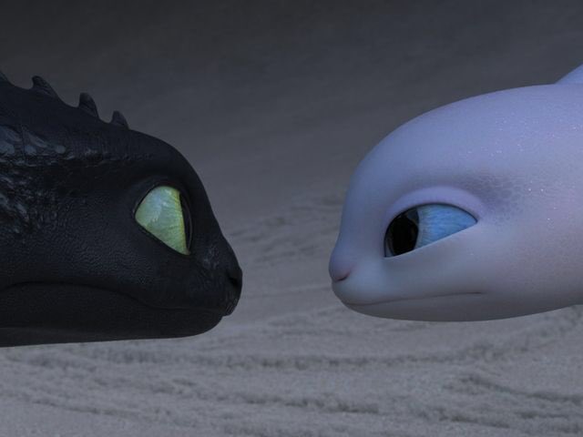
She is obviously a nightfury, so she will look similar to Toothless. This cannot be argued. She has been designed to be more aquatic due to her environment, with slim, minimal appearance to appear smooth like an amphibian. It is not too aquatic that it would be overbearing to the design. The glittery skin works, it looks like smooth pebbles in a cave or water, kids would love it.
She could be albino, but instead of the pink pigment albinos have, she has a more blue hue. Possibly to drive the water motif home, it appears like crystal clear water. White and blue are aesthetically pleasing, not too contrasting, it also compliments Toothless' eyes unlike how pink would look if they just copied albino pigments. Pink is considered "too stereotypically girly" and I could imagine the backlash.
She isn't just a lazy recolour, even though she is meant to be the same species.
The contrast gives her independence as a character. If she were black like Toothless, she would barely stand out as a character. She would be even more deemed to the general public as a "girl toothless" which is obviously not what they want. She is clearly going to have a great importance to the story, so the black and white contrast between them strengthens that. Not to mention how well it can be used for marketing as a definite "this dragon is from How to Train your Dragon but is not Toothless but people who like Toothless will love this"
The toys will sell. It is a marketable, simple, elegant, functional design. It defines her personality without straying too far from the species.